
If you’ve been building SharePoint Framework web parts for a while, you know one thing users always ask for: a clean drag-and-drop file upload experience. The default SharePoint upload UI works fine, but when you’re building a custom web part, you want full control. You want users to drop files onto a zone, see them listed, and hit upload. Simple.
In this tutorial, I’ll walk you through three practical methods to build drag-and-drop file uploads in SPFx, from a single file using plain HTML5, to multiple files using the react-dropzone library, and finally using the PnP DragDropFiles reusable control. I’ll cover real code, PnPjs v4 for the upload calls, and tips you’ll actually use on the job.
What We’re Building
By the end of this tutorial, you’ll have an SPFx React web part that:
- Let users drag and drop one or multiple files onto a drop zone
- Shows a file list before uploading
- Uploads files to a SharePoint document library using PnPjs v3
- Handles large files (over 10 MB) with chunked upload
- Validates file types and sizes
Prerequisites
Before you start, make sure you have these set up:
- Node.js v22.x
- SPFx Yeoman generator v1.20+ (targets SharePoint Online)
- A SharePoint Online site with a document library (I’ll use
Shared Documents) - Basic knowledge of React and TypeScript
Setting Up Your SPFx Project
Open your terminal and scaffold a new web part:
yo @microsoft/sharepoint
When prompted:
- Solution name:
spfx-drag-drop-upload - Framework: React
- Web part name:
FileUploader

Once scaffolded, install your dependencies:
npm install @pnp/sp @pnp/spfx-controls-react react-dropzone --save
Here’s what each package does:
@pnp/sp= PnPjs v4 for all SharePoint REST API calls (upload, read, delete)@pnp/spfx-controls-react= PnP’s ready-made React controls, includingDragDropFilesreact-dropzone= A popular, lightweight library specifically built for drag-and-drop file handling in React
Setting Up PnPjs v4
Open FileUploaderWebPart.ts and configure PnPjs in the onInit method. This is the correct pattern for PnPjs v4; you no longer use the global sp singleton from older versions.
import * as React from 'react';
import * as ReactDom from 'react-dom';
import { Version } from '@microsoft/sp-core-library';
import {
  type IPropertyPaneConfiguration,
  PropertyPaneTextField
} from '@microsoft/sp-property-pane';
import { BaseClientSideWebPart } from '@microsoft/sp-webpart-base';
import { spfi, SPFI, SPFx } from '@pnp/sp';

import * as strings from 'FileUploaderWebPartStrings';
import FileUploader from './components/FileUploader';
import { IFileUploaderProps } from './components/IFileUploaderProps';

export interface IFileUploaderWebPartProps {
  libraryName: string;
}

export default class FileUploaderWebPart extends BaseClientSideWebPart<IFileUploaderWebPartProps> {

  private _sp!: SPFI;

  public render(): void {
    const element: React.ReactElement<IFileUploaderProps> = React.createElement(
      FileUploader,
      {
        sp: this._sp,
        libraryName: this.properties.libraryName,
        webServerRelativeUrl: this.context.pageContext.web.serverRelativeUrl
      }
    );

    ReactDom.render(element, this.domElement);
  }


  protected getPropertyPaneConfiguration(): IPropertyPaneConfiguration {
    return {
      pages: [
        {
          header: {
            description: strings.PropertyPaneDescription
          },
          groups: [
            {
              groupName: strings.BasicGroupName,
              groupFields: [
                PropertyPaneTextField('libraryName', {
                  label: strings.LibraryNameFieldLabel
                })
              ]
            }
          ]
        }
      ]
    };
  }
}
Pass this._sp down as a prop to your React component. Never initialize PnPjs inside the component itself; the onInit method is the right place.
Check out PnP React Pagination Control in SharePoint Framework (SPFx) Web Part
Method 1: HTML5 Drag and Drop (No Libraries) In SPFx
This is the raw approach; no external libraries, just native browser drag-and-drop events. It’s a great way to understand what’s happening under the hood, and it works fine for single or multiple files.
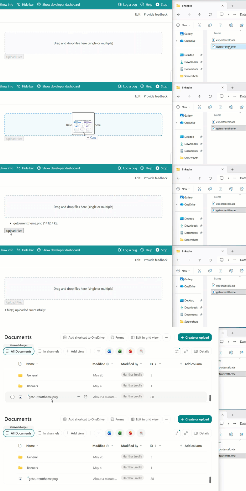
Here is the component code you can add to the .tsx file.
import * as React from 'react';
import { SPFI } from "@pnp/sp";
import "@pnp/sp/webs";
import "@pnp/sp/files";
import "@pnp/sp/folders";

interface IHtmlDropZoneProps {
  sp: SPFI;
  libraryName: string;
}

interface IHtmlDropZoneState {
  files: File[];
  uploading: boolean;
  message: string;
  isDragging: boolean;
}

export default class HtmlDropZone extends React.Component<IHtmlDropZoneProps, IHtmlDropZoneState> {
  constructor(props: IHtmlDropZoneProps) {
    super(props);
    this.state = { files: [], uploading: false, message: '', isDragging: false };
  }

  private _onDragOver = (e: React.DragEvent<HTMLDivElement>): void => {
    e.preventDefault(); // This line is mandatory — without it, the drop won't work
    this.setState({ isDragging: true });
  }

  private _onDragLeave = (): void => {
    this.setState({ isDragging: false });
  }

  private _onDrop = (e: React.DragEvent<HTMLDivElement>): void => {
    e.preventDefault();
    this.setState({ isDragging: false });
    const droppedFiles = Array.from(e.dataTransfer.files);
    this.setState({ files: [...this.state.files, ...droppedFiles] });
  }

  private _uploadFiles = async (): Promise<void> => {
    const { sp, libraryName } = this.props;
    const { files } = this.state;

    if (!files.length) return;

    this.setState({ uploading: true, message: '' });

    try {
      for (const file of files) {
        const siteRelativeUrl = `/sites/YourSiteName/${libraryName}`;

        if (file.size <= 10 * 1024 * 1024) {

          await sp.web
            .getFolderByServerRelativePath(siteRelativeUrl)
            .files.addUsingPath(file.name, file, { Overwrite: true });
        } else {

          await sp.web
            .getFolderByServerRelativePath(siteRelativeUrl)
            .files.addChunked(file.name, file, undefined, true);
        }
      }
      this.setState({ files: [], message: `${files.length} file(s) uploaded successfully!` });
    } catch (err) {
      this.setState({ message: `Upload failed: ${err.message}` });
    } finally {
      this.setState({ uploading: false });
    }
  }

  public render(): React.ReactElement {
    const { files, uploading, message, isDragging } = this.state;

    const dropZoneStyle: React.CSSProperties = {
      border: `2px dashed ${isDragging ? '#0078d4' : '#ccc'}`,
      borderRadius: '8px',
      padding: '40px',
      textAlign: 'center',
      backgroundColor: isDragging ? '#f0f8ff' : '#fafafa',
      cursor: 'pointer',
      transition: 'all 0.2s ease'
    };

    return (
      <div>
        <div
          style={dropZoneStyle}
          onDragOver={this._onDragOver}
          onDragLeave={this._onDragLeave}
          onDrop={this._onDrop}
        >
          {isDragging ? 'Release to drop files here' : 'Drag and drop files here (single or multiple)'}
        </div>

        {files.length > 0 && (
          <ul>
            {files.map((f, i) => <li key={i}>{f.name} ({(f.size / 1024).toFixed(1)} KB)</li>)}
          </ul>
        )}

        <button onClick={this._uploadFiles} disabled={uploading || !files.length}>
          {uploading ? 'Uploading...' : 'Upload Files'}
        </button>

        {message && <p>{message}</p>}
      </div>
    );
  }
}
A few things worth noting about this approach:
e.preventDefault()insideonDragOveris not optional — browsers block drops by default. Without this line, nothing will drop.- The
10 MBthreshold is the recommended split betweenaddUsingPath(for regular files) andaddChunked(for large ones). PnPjs handles chunked uploads using SharePoint’sStartUpload,ContinueUpload, andFinishUploadREST APIs behind the scenes. Array.from(e.dataTransfer.files)converts theFileListobject (which isn’t a real array) into a proper JavaScript array so you can spread and iterate it.
Read: Fluent UI React ComboBox Control in SPFx
Method 2: react-dropzone (Recommended for Most SPFx Projects)
react-dropzone is the most popular approach for SPFx drag-and-drop uploads, and for good reason. It handles all the tricky drag-and-drop edge cases for you — browser inconsistencies, file type filtering, accept attributes, and even click-to-browse. It also works beautifully for both single and multiple files.
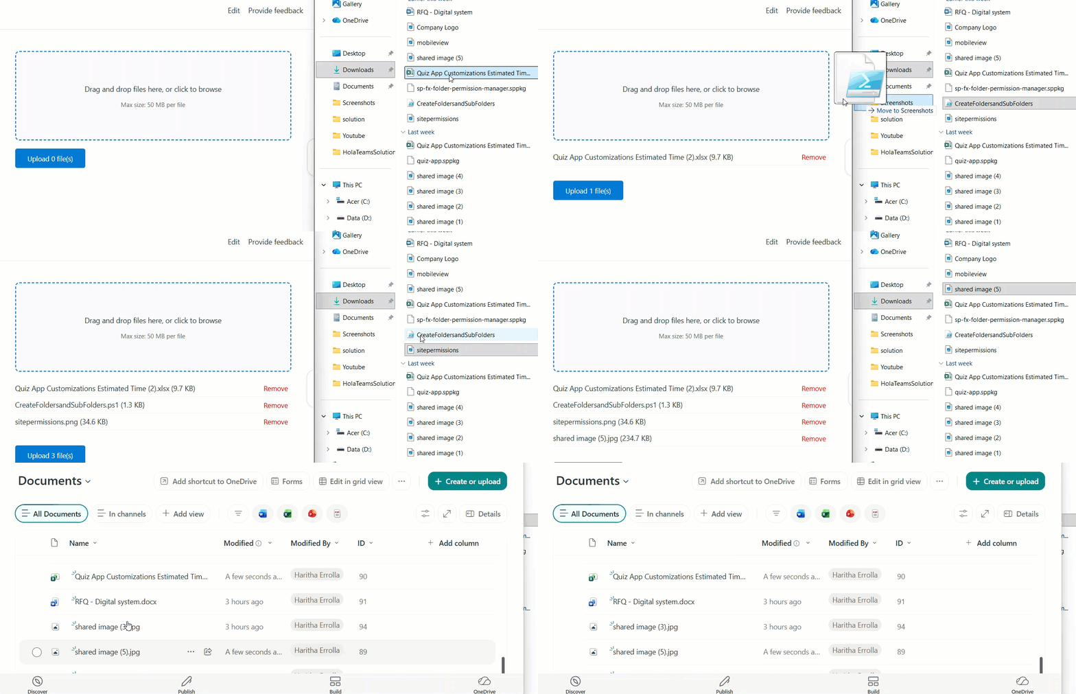
Install Packages
npm install react-dropzone --save
Provide this in the .ts file to send props to the component file and initialize the PnJS Instance.
import * as React from 'react';
import * as ReactDom from 'react-dom';
import { Version } from '@microsoft/sp-core-library';
import {
  type IPropertyPaneConfiguration,
  PropertyPaneTextField
} from '@microsoft/sp-property-pane';
import { BaseClientSideWebPart } from '@microsoft/sp-webpart-base';
import { spfi, SPFI, SPFx } from '@pnp/sp';

import * as strings from 'ReactDropzoneUploaderWebPartStrings';
import ReactDropZoneUploader from './components/ReactDropZoneUploader';
import type { IDropZoneProps } from './components/IDropZoneProps';

export interface IReactDropzoneUploaderWebPartProps {
  libraryName: string;
  acceptedTypes: string;
  maxSizeMB: string;
}

export default class ReactDropzoneUploaderWebPart extends BaseClientSideWebPart<IReactDropzoneUploaderWebPartProps> {

  private _sp!: SPFI;

  public render(): void {
    const acceptedTypes = this.properties.acceptedTypes
      ? this.properties.acceptedTypes.split(',').map(t => t.trim()).filter(t => !!t)
      : undefined;
    const maxSizeMB = Number(this.properties.maxSizeMB);

    const element: React.ReactElement<IDropZoneProps> = React.createElement(
      ReactDropZoneUploader,
      {
        sp: this._sp,
        libraryName: this.properties.libraryName,
        siteRelativeUrl: this.context.pageContext.web.serverRelativeUrl,
        acceptedTypes,
        maxSizeMB: maxSizeMB > 0 ? maxSizeMB : undefined
      }
    );

    ReactDom.render(element, this.domElement);
  }

  protected onInit(): Promise<void> {
    this._sp = spfi().using(SPFx(this.context));
    return Promise.resolve();
  }

  protected getPropertyPaneConfiguration(): IPropertyPaneConfiguration
    return {
      pages: [
        {
          header: {
            description: strings.PropertyPaneDescription
          },
          groups: [
            {
              groupName: strings.BasicGroupName,
              groupFields: [
                PropertyPaneTextField('libraryName', {
                  label: strings.LibraryNameFieldLabel
                }),
                PropertyPaneTextField('acceptedTypes', {
                  label: strings.AcceptedTypesFieldLabel,
                  description: strings.AcceptedTypesFieldDescription
                }),
                PropertyPaneTextField('maxSizeMB', {
                  label: strings.MaxSizeFieldLabel
                })
              ]
            }
          ]
        }
      ]
    };
  }
}
Then, here is the component, you can update it on the .tsx file.
import * as React from 'react';
import { useDropzone, Accept, ErrorCode, FileError } from 'react-dropzone';
import "@pnp/sp/webs";
import "@pnp/sp/files";
import "@pnp/sp/folders";
import type { IDropZoneProps } from './IDropZoneProps';


const EXTENSION_MIME_MAP: Record<string, string> = {
  '.pdf': 'application/pdf',
  '.doc': 'application/msword',
  '.docx': 'application/vnd.openxmlformats-officedocument.wordprocessingml.document',
  '.xls': 'application/vnd.ms-excel',
  '.xlsx': 'application/vnd.openxmlformats-officedocument.spreadsheetml.sheet',
  '.ppt': 'application/vnd.ms-powerpoint',
  '.pptx': 'application/vnd.openxmlformats-officedocument.presentationml.presentation',
  '.png': 'image/png',
  '.jpg': 'image/jpeg',
  '.jpeg': 'image/jpeg',
  '.gif': 'image/gif',
  '.txt': 'text/plain',
  '.csv': 'text/csv',
  '.zip': 'application/zip'
};

function buildAcceptOption(extensions: string[]): Accept {
  return extensions.reduce<Accept>((acc, ext) => {
    const mimeType = EXTENSION_MIME_MAP[ext.toLowerCase()] || 'application/octet-stream';
    return { ...acc, [mimeType]: [...(acc[mimeType] || []), ext] };
  }, {});
}


function getFriendlyRejectionMessage(error: FileError, acceptedTypes: string[] | undefined, maxSizeMB: number): string {
  switch (error.code) {
    case ErrorCode.FileInvalidType:
      return acceptedTypes && acceptedTypes.length
        ? `This file type isn't supported. Accepted types: ${acceptedTypes.join(', ')}`
        : `This file type isn't supported.`;
    case ErrorCode.FileTooLarge:
      return `File is too large. Maximum size is ${maxSizeMB} MB.`;
    case ErrorCode.FileTooSmall:
      return `File is too small.`;
    case ErrorCode.TooManyFiles:
      return `Too many files selected at once.`;
    default:
      return error.message;
  }
}

const MAX_SINGLE_REQUEST_UPLOAD_SIZE = 10 * 1024 * 1024;

const ReactDropZoneUploader: React.FC<IDropZoneProps> = ({
  sp, libraryName, siteRelativeUrl, acceptedTypes, maxSizeMB = 50
}) => {
  const [files, setFiles] = React.useState<File[]>([]);
  const [uploading, setUploading] = React.useState(false);
  const [statusMap, setStatusMap] = React.useState<Record<string, string>>({});

  const maxSize = maxSizeMB * 1024 * 1024;

  const { getRootProps, getInputProps, isDragActive, fileRejections } = useDropzone({
    multiple: true, // Set to false if you only want single file
    maxSize: maxSize,
    accept: acceptedTypes && acceptedTypes.length ? buildAcceptOption(acceptedTypes) : undefined,
    onDrop: (acceptedFiles: File[]) => {
      setFiles(prev => [...prev, ...acceptedFiles]);
    }
  });

  const removeFile = (index: number): void => {
    setFiles(prev => prev.filter((_, i) => i !== index));
  };

  const uploadFiles = async (): Promise<void> => {
    if (!files.length) return;

    setUploading(true);
    const folder = sp.web.getFolderByServerRelativePath(`${siteRelativeUrl}/${libraryName}`);
    const newStatus: Record<string, string> = {};

    for (const file of files) {
      try {
        if (file.size <= MAX_SINGLE_REQUEST_UPLOAD_SIZE) {
          await folder.files.addUsingPath(file.name, file, { Overwrite: true });
        } else {
          await folder.files.addChunked(file.name, file, { Overwrite: true });
        }
        newStatus[file.name] = '✅ Uploaded';
      } catch (err) {
        const errorMessage = err instanceof Error ? err.message : String(err);
        newStatus[file.name] = `❌ Failed: ${errorMessage}`;
      }
    }

    setStatusMap(newStatus);
    setUploading(false);
    setFiles([]);
  };

  const dropZoneStyle: React.CSSProperties = {
    border: '2px dashed #0078d4',
    borderRadius: '8px',
    padding: '48px 24px',
    textAlign: 'center',
    backgroundColor: isDragActive ? '#e8f4fb' : '#f9f9f9',
    cursor: 'pointer',
    transition: 'background-color 0.2s ease'
  };

  return (
    <div style={{ fontFamily: 'Segoe UI, sans-serif', maxWidth: '600px' }}>
      <div {...getRootProps({ style: dropZoneStyle })}>
        <input {...getInputProps()} />
        {isDragActive
          ? <p>Drop your files here...</p>
          : <p>Drag and drop files here, or click to browse</p>
        }
        <p style={{ fontSize: '12px', color: '#666' }}>
          Max size: {maxSizeMB} MB per file
          {acceptedTypes && ` | Accepted: ${acceptedTypes.join(', ')}`}
        </p>
      </div>

      {/* Rejected files */}
      {fileRejections.length > 0 && (
        <div style={{ color: 'red', marginTop: '8px' }}>
          {fileRejections.map(({ file, errors }) => (
            <p key={file.name}>
              {file.name}: {errors.map(e => getFriendlyRejectionMessage(e, acceptedTypes, maxSizeMB)).join(', ')}
            </p>
          ))}
        </div>
      )}

      {/* Accepted file list */}
      {files.length > 0 && (
        <ul style={{ listStyle: 'none', padding: 0, marginTop: '16px' }}>
          {files.map((f, i) => (
            <li key={i} style={{ display: 'flex', justifyContent: 'space-between', padding: '6px 0', borderBottom: '1px solid #eee' }}>
              <span>{f.name} ({(f.size / 1024).toFixed(1)} KB)</span>
              <button onClick={() => removeFile(i)} style={{ color: 'red', border: 'none', background: 'none', cursor: 'pointer' }}>Remove</button>
            </li>
          ))}
        </ul>
      )}

      {/* Upload status */}
      {Object.entries(statusMap).map(([name, status]) => (
        <p key={name} style={{ fontSize: '13px' }}>{name}: {status}</p>
      ))}

      <button
        onClick={uploadFiles}
        disabled={uploading || !files.length}
        style={{
          marginTop: '16px',
          padding: '10px 24px',
          backgroundColor: '#0078d4',
          color: '#fff',
          border: 'none',
          borderRadius: '4px',
          cursor: uploading ? 'not-allowed' : 'pointer'
        }}
      >
        {uploading ? 'Uploading...' : `Upload ${files.length} file(s)`}
      </button>
    </div>
  );
};

export default ReactDropZoneUploader;
A few things I really like about react-dropzone:
- The
useDropzonehook returnsgetRootPropsandgetInputProps— spread those onto your drop zonedivand input. It wires up all the event handlers automatically. - The
acceptprop lets you restrict file types. For example,{'.pdf': [], '.docx': []}means only PDFs and Word documents can be dropped. fileRejectionsgives you a ready-made list of files that were blocked (wrong type or too large) — perfect for showing error messages.- Setting
multiple: falseturns the whole thing into a single-file uploader without changing anything else.
Here, you can also see that in the property pane for Accepted File Types, I added the .pdf extension, and then tried to upload a .xlsx file, which shows an error. In this way, we can restrict file types during upload.

Check out Add Custom Controls in SPFx Property Pane
Method 3: PnP DragDropFiles Control in SPFx
If you’re already using @pnp/spfx-controls-react it in your project, and many SPFx projects do, then you have the DragDropFiles control available at no extra cost. It’s the quickest way to add a drop zone with the least code.
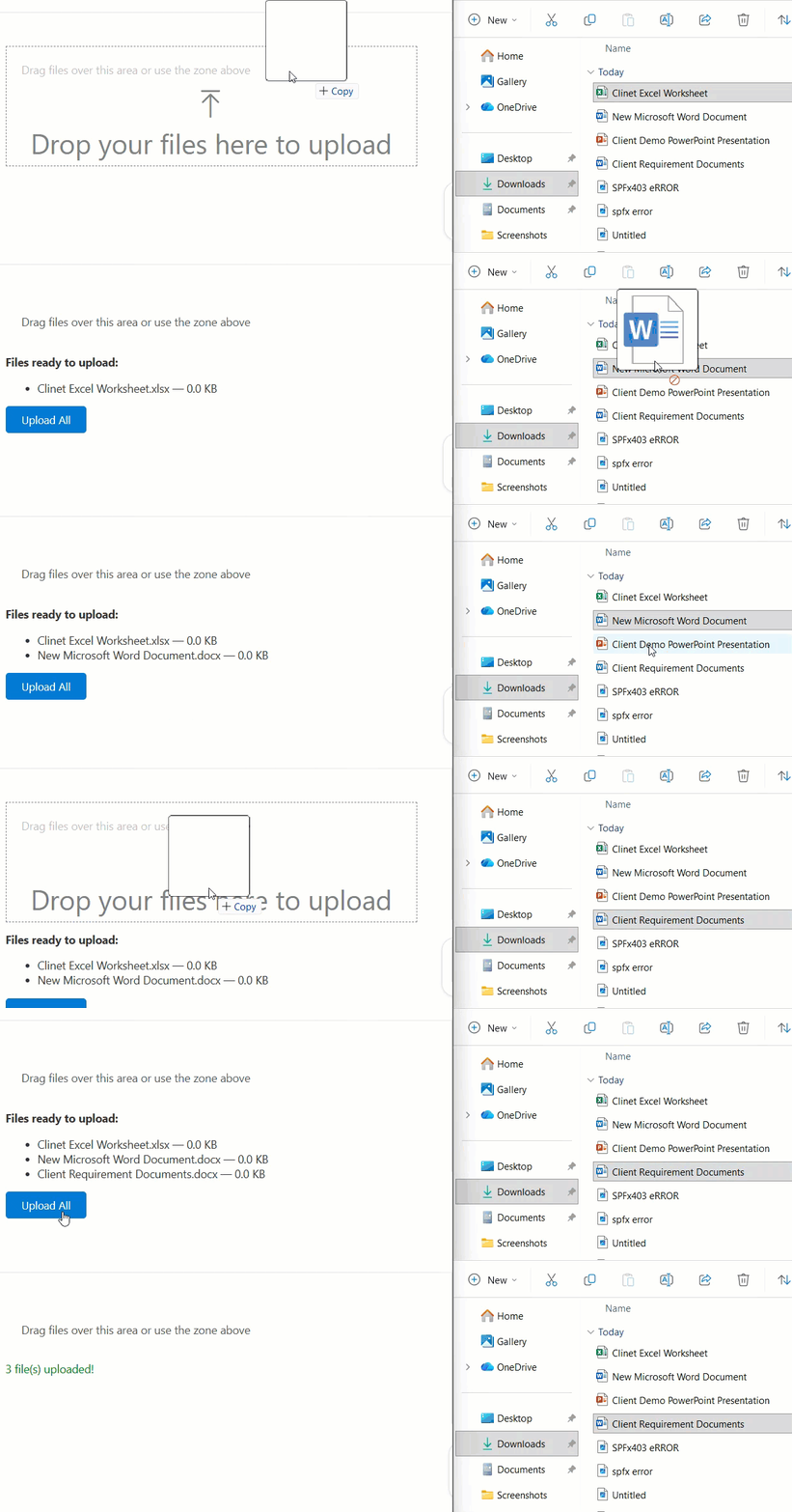
Install the PnP Controls
npm install @pnp/spfx-controls-react --save --save-exact
Update your component file with the following code.
import * as React from 'react';
import { DragDropFiles } from "@pnp/spfx-controls-react/lib/DragDropFiles";
import { SPFI } from "@pnp/sp";
import "@pnp/sp/webs";
import "@pnp/sp/files";
import "@pnp/sp/folders";

interface IPnPDropZoneProps {
  sp: SPFI;
  siteRelativeUrl: string;
  libraryName: string;
}

interface IPnPDropZoneState {
  droppedFiles: File[];
  uploading: boolean;
  message: string;
}

export default class PnPDragDropUploader extends React.Component<IPnPDropZoneProps, IPnPDropZoneState> {
  constructor(props: IPnPDropZoneProps) {
    super(props);
    this.state = { droppedFiles: [], uploading: false, message: '' };
  }

  private _onDrop = (files: File[]): void => {
    // The DragDropFiles control returns a File[] array directly
    this.setState({ droppedFiles: [...this.state.droppedFiles, ...files] });
  }

  private _uploadAll = async (): Promise<void> => {
    const { sp, siteRelativeUrl, libraryName } = this.props;
    const { droppedFiles } = this.state;
    const folderPath = `${siteRelativeUrl}/${libraryName}`;

    this.setState({ uploading: true, message: '' });

    try {
      for (const file of droppedFiles) {
        if (file.size <= 10 * 1024 * 1024) {
          await sp.web
            .getFolderByServerRelativePath(folderPath)
            .files.addUsingPath(file.name, file, { Overwrite: true });
        } else {
          await sp.web
            .getFolderByServerRelativePath(folderPath)
            .files.addChunked(file.name, file, undefined, true);
        }
      }
      this.setState({ message: `${droppedFiles.length} file(s) uploaded!`, droppedFiles: [] });
    } catch (err) {
      this.setState({ message: `Error: ${err.message}` });
    } finally {
      this.setState({ uploading: false });
    }
  }

  public render(): React.ReactElement {
    const { droppedFiles, uploading, message } = this.state;

    return (
      <div style={{ fontFamily: 'Segoe UI, sans-serif' }}>
        <DragDropFiles
          dropEffect="copy"
          enable={true}
          onDrop={this._onDrop}
          iconName="Upload"
          labelMessage="Drop your files here to upload"
        >
          <div style={{ padding: '20px', color: '#555' }}>
            Drag files over this area or use the zone above
          </div>
        </DragDropFiles>

        {droppedFiles.length > 0 && (
          <div style={{ marginTop: '12px' }}>
            <strong>Files ready to upload:</strong>
            <ul>
              {droppedFiles.map((f, i) => (
                <li key={i}>{f.name} — {(f.size / 1024).toFixed(1)} KB</li>
              ))}
            </ul>
            <button
              onClick={this._uploadAll}
              disabled={uploading}
              style={{ padding: '8px 20px', backgroundColor: '#0078d4', color: '#fff', border: 'none', borderRadius: '4px', cursor: 'pointer' }}
            >
              {uploading ? 'Uploading...' : 'Upload All'}
            </button>
          </div>
        )}

        {message && <p style={{ marginTop: '10px', color: message.startsWith('Error') ? 'red' : 'green' }}>{message}</p>}
      </div>
    );
  }
}
What’s nice about DragDropFiles:
- You get a styled, accessible drop zone immediately with
iconNameandlabelMessageprops. - The
onDropcallback hands you a cleanFile[]— no need to parsedataTransfer.filesyourself. - You can nest any child content (like a
ListViewor form fields) inside the control. The entire nested area becomes the drop zone. - The
dropEffectprop controls the cursor visual (copy,move,link, ornone).
Uploading to a Subfolder
What if users need to upload into a specific subfolder, not the root of the library? Easy — just append the folder path:
const folderPath = `/sites/YourSiteName/Shared Documents/Reports/Q1-2025`;

await sp.web
  .getFolderByServerRelativePath(folderPath)
  .files.addUsingPath(file.name, file, { Overwrite: true });
If the subfolder might not exist yet, create it first:
await sp.web
  .getFolderByServerRelativePath(`/sites/YourSiteName/Shared Documents`)
  .addSubFolderUsingPath("Reports/Q1-2025");
Handling Large Files with Chunked Upload in SPFx
For files larger than 10 MB, addUsingPath will time out. Use addChunked instead:
await sp.web
  .getFolderByServerRelativePath(folderPath)
  .files.addChunked(
    file.name,
    file,
    (data) => {
      console.log(`Progress: ${data.blockNumber} chunks uploaded`);
    },
    true // Overwrite = true
  );
The third argument is an optional progress callback — handy if you want to show a progress bar to your users. PnPjs splits the file into chunks and calls SharePoint’s upload session API automatically. You don’t need to manage chunk sizes yourself.
Which Method Should You Pick?
Here’s how I think about it:
| Your situation | Method to use |
|---|---|
| Quick prototype, no extra libraries | Method 1 — Plain HTML5 |
| Need file type filtering, size validation, click-to-browse | Method 2 — react-dropzone |
Already using @pnp/spfx-controls-react | Method 3 — PnP DragDropFiles |
| Need to wrap an existing web part area as a drop zone | Method 3 — PnP DragDropFiles (it accepts child components) |
| Building for Teams + SharePoint | Method 2 — react-dropzone (most portable) |
Common Issues and Fixes
Drop zone doesn’t work at all
You probably forgot e.preventDefault() in onDragOver. Browsers block drop events by default — that’s a security measure. You have to explicitly allow it.
Files show as 0 bytes or empty in SharePoint
This happens when you read the file with FileReader and try to pass the result directly. With PnPjs v4, just pass the File object directly to addUsingPath or addChunked. No need to manually read it.
“Access denied” error on upload
Your web part’s SPFx manifest needs FullControl or Write permission on the site collection. Check package-solution.json under webApiPermissionRequests, or verify the user has contribute access to the document library.
Files not appearing in the library
Double-check your siteRelativeUrl. It must be the server-relative URL — starting with /sites/YourSiteName. Using the absolute URL will cause a 400 error.
Multiple files only uploading one
If you’re using a for...of loop await, make sure the loop itself is inside an async function. If you accidentally use .forEach with an async callback, the awaits won’t block correctly.
A Quick Note on SPFx Permissions
Your web part needs the right permissions to write to SharePoint. In package-solution.json, make sure you have:
"webApiPermissionRequests": [],
"isDomainIsolated": false
SPFx web parts running in the context of a SharePoint page already inherit the current user’s permissions — so as long as the user has Contribute or higher on the library, the upload will work without extra API permissions. If you’re uploading to a different site collection, you’ll need to set up cross-site permissions explicitly.
Deploying Your SPFx Web Part
Once your web part is ready:
heft clean
heft build --production
heft package-solution --production
Upload the .sppkg file from the sharepoint/solution folder to your App Catalog. Approve any permissions prompts, then add the web part to any page.
Wrapping Up
You’ve now got three solid ways to build drag-and-drop file uploads in SPFx. My personal go-to for most projects is react-dropzone — It’s well-maintained, has good TypeScript support, and handles all the annoying edge cases. The PnP DragDropFiles control is great when you want something fast and already have the PnP controls library in your solution. And plain HTML5 is always there when you want to keep things lean.
The upload logic using PnPjs v4 is the same across all three methods — addUsingPath for small files, addChunked for anything over 10 MB. Once you have that pattern down, you can swap the UI layer freely.
Also, you may like:
- SPFx Web Part Audience Targeting: Show Content to the Right People
- Format Dates in SharePoint Framework (SPFx)
- Bind SharePoint List Items to SPFx Fluent UI React Dropdown (Step-by-Step)
- Create a Modal Popup in SPFx (4 Methods with Full Examples)

Hey! I’m Bijay Kumar, founder of SPGuides.com and a Microsoft Business Applications MVP (Power Automate, Power Apps). I launched this site in 2020 because I truly enjoy working with SharePoint, Power Platform, and SharePoint Framework (SPFx), and wanted to share that passion through step-by-step tutorials, guides, and training videos. My mission is to help you learn these technologies so you can utilize SharePoint, enhance productivity, and potentially build business solutions along the way.