
If you’ve ever built an SPFx web part where users need to pick a Country first and then a State from that country — you already know the problem. Show all 50 states upfront, and you’ll confuse users. That’s exactly where a cascading dropdown saves the day.
In this tutorial, I’ll walk you through building a cascading dropdown in an SPFx web part property pane using two real SharePoint lists — a Country list and a State list. When a user picks a country, the state dropdown automatically loads only the states that belong to that country.
If you are new to SPFx and want to learn SharePoint Framework development, check out the complete SharePoint Framework development training course.
Let me show you exactly how to set this up, step by step.
What Is a Cascading Dropdown?
A cascading dropdown (also called a dependent dropdown) is when the options in one dropdown change based on what you pick in another dropdown.
For example:
- You pick United States in the Country dropdown
- The State dropdown immediately updates to show only California, Texas, New York, Florida, etc.
- If you switch to Canada, the options change to Ontario, British Columbia, Quebec, and so on.
This is a really common pattern in SharePoint web parts, especially for forms or configuration panels.
What We’re Building
Here’s the full scenario:
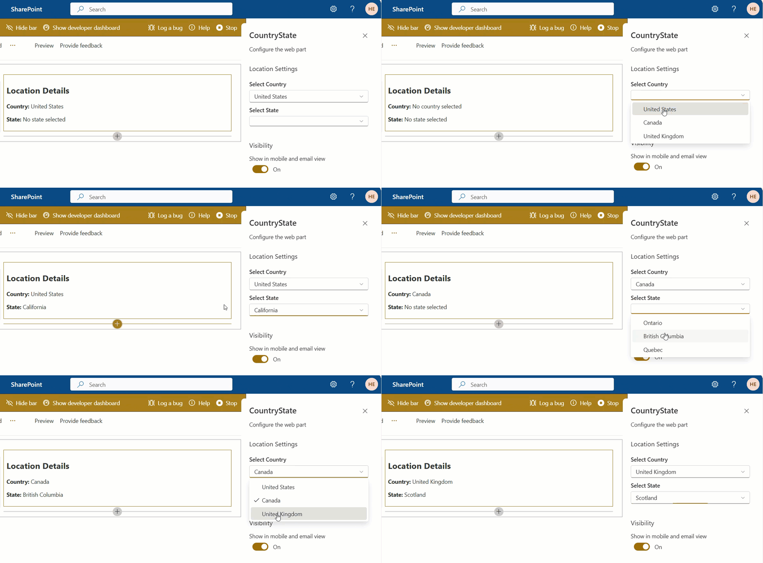
Input: User opens the web part property pane and selects a country from the Country dropdown.
Output: The State dropdown automatically loads and shows only the states that belong to the selected country. The user can then pick a state, and both values are displayed in the web part body.
SharePoint Lists We’ll Use
Before we touch any code, let’s get our two SharePoint lists ready. These are the data source for our dropdowns.
List 1: Country
Create a SharePoint list called Country with a Title column (default).
| ID | Title |
|---|---|
| 1 | United States |
| 2 | Canada |
| 3 | United Kingdom |

List 2: State
Create a SharePoint list called State with two columns:
Title— the state nameCountry— a Lookup column that points to the Country list
| ID | Title | Country |
|---|---|---|
| 1 | California | United States |
| 2 | Texas | United States |
| 3 | New York | United States |
| 4 | Florida | United States |
| 5 | Ontario | Canada |
| 6 | British Columbia | Canada |
| 7 | Quebec | Canada |
| 8 | England | United Kingdom |
| 9 | Scotland | United Kingdom |

That’s it. No fancy setup needed. Just these two lists with the data above.
Prerequisites
Before we start coding, make sure you have:
- Node.js (v18.x LTS recommended as of 2025–2026)
- SharePoint Framework Yeoman generator installed (
@microsoft/generator-sharepoint) - Heft installed globally
- Access to a SharePoint Online site where you’ve created the two lists above
- Basic familiarity with TypeScript and React
If you need to set up your dev environment from scratch, check the official Microsoft docs for SPFx setup — it takes about 15 minutes.
Step 1: Scaffold a New SPFx Project
Open your terminal and run:
md spfx-cascading-dropdown
cd spfx-cascading-dropdown
yo @microsoft/sharepoint
When the Yeoman generator asks you questions, answer like this:
- Solution name:
spfx-cascading-dropdown - Type of client-side component:
WebPart - Web part name:
CountryState - Template:
React

Once the scaffolding finishes, open the project in VS Code:
code .
Step 2: Define Web Part Properties
We need two properties to store the user’s selections — one for the selected country and one for the selected state.
2a. Update the manifest
Open src/webparts/countryState/CountryStateWebPartManifest.json and update the properties section:
"properties": {
"selectedCountry": "",
"selectedState": ""
}
2b. Update the props interface
Open src/webparts/countryState/ICountryStateWebPartProps.ts and replace its content with:
export interface ICountryStateWebPartProps {
selectedCountry: string;
selectedState: string;
}
Step 3: Set Up the PnPjs Library
We’ll use PnPjs to query the SharePoint lists. It’s clean, well-maintained, and makes REST calls much simpler.
Install the required packages:
npm install @pnp/sp --save
Step 4: Initialize PnPjs in the Web Part
Open src/webparts/countryState/CountryStateWebPart.ts.
Add the import at the top:
import { spfi, SPFx } from "@pnp/sp";
import "@pnp/sp/webs";
import "@pnp/sp/lists";
import "@pnp/sp/items";
import {
IPropertyPaneConfiguration,
PropertyPaneDropdown,
IPropertyPaneDropdownOption
} from '@microsoft/sp-property-pane';
Then inside the class, add:
private _sp: ReturnType<typeof spfi>;
protected onInit(): Promise<void> {
this._sp = spfi().using(SPFx(this.context));
return super.onInit();
}
This gives us a ready-to-use _sp instance throughout the web part.
Step 5: Declare State Variables
Inside the CountryStateWebPart class, add these private variables right after the class declaration opening brace:
private countries: IPropertyPaneDropdownOption[] = [];
private states: IPropertyPaneDropdownOption[] = [];
private countriesDropdownDisabled: boolean = true;
private statesDropdownDisabled: boolean = true;
private loadingIndicator: boolean = true;
Here’s what each one does:
countries— stores the list of country options for the first dropdownstates— stores the state options filtered by the selected countrycountriesDropdownDisabled— keeps the country dropdown locked until data loadsstatesDropdownDisabled— keeps the state dropdown locked until a country is pickedloadingIndicator— shows a spinner in the property pane while data loads
Step 6: Load Countries from SharePoint
Add this method to the class. This calls the Country list and maps the results into IPropertyPaneDropdownOption format:
private async loadCountries(): Promise<IPropertyPaneDropdownOption[]> {
const items = await this._sp.web.lists
.getByTitle("Country")
.items
.select("Id", "Title")();
return items.map((item: { Id: number; Title: string }) => ({
key: item.Title,
text: item.Title
}));
}
What this does:
- Connects to the Country SharePoint list
- Fetches the
IdandTitlecolumns - Returns an array like
[{ key: "United States", text: "United States" }, ...]
Step 7: Load States Based on Selected Country
Now add a method to load states. Notice how it filters using a $filter query on the Country lookup column:
private async loadStates(): Promise<IPropertyPaneDropdownOption[]> {
if (!this.properties.selectedCountry) {
return [];
}
const items = await this._sp.web.lists
.getByTitle("State")
.items
.select("Id", "Title", "Country/Title")
.expand("Country")
.filter(`Country/Title eq '${this.properties.selectedCountry}'`)();
return items.map((item: { Id: number; Title: string }) => ({
key: item.Title,
text: item.Title
}));
}
What this does:
- Checks if a country has been selected — returns empty if not
- Uses OData
$filterto only fetch states whereCountry/Titlematches the selected country - Expands the
Countrylookup column to read itsTitle - Returns mapped dropdown options
So if the user selects United States, this method queries: Country/Title eq 'United States' and returns California, Texas, New York, and Florida.
Step 8: Trigger Loading When Property Pane Opens
Override the onPropertyPaneConfigurationStart() method. This runs every time the user opens the property pane:
protected async onPropertyPaneConfigurationStart(): Promise<void> {
this.countriesDropdownDisabled = !this.countries.length;
this.statesDropdownDisabled = !this.properties.selectedCountry || !this.states.length;
if (this.countries.length) {
return;
}
this.loadingIndicator = true;
this.context.propertyPane.refresh();
// Load countries
this.countries = await this.loadCountries();
this.countriesDropdownDisabled = false;
// If a country was previously selected, load its states too
if (this.properties.selectedCountry) {
this.states = await this.loadStates();
this.statesDropdownDisabled = false;
}
this.loadingIndicator = false;
this.context.propertyPane.refresh();
}
This method makes sure:
- Countries only load once (not on every open)
- If the user previously selected a country, the states for it are pre-loaded
- The spinner shows and hides correctly
Step 9: React When Country Changes
This is the key part of the cascading behavior. Override onPropertyPaneFieldChanged():
protected async onPropertyPaneFieldChanged(
propertyPath: string,
oldValue: string,
newValue: string
): Promise<void> {
if (propertyPath === 'selectedCountry' && newValue) {
// Show loading spinner
this.loadingIndicator = true;
// Save the new country value
super.onPropertyPaneFieldChanged(propertyPath, oldValue, newValue);
// Reset state selection
this.properties.selectedState = '';
// Disable state dropdown while loading
this.statesDropdownDisabled = true;
this.context.propertyPane.refresh();
// Load states for the new country
this.states = await this.loadStates();
// Enable state dropdown
this.statesDropdownDisabled = false;
// Hide loading spinner
this.loadingIndicator = false;
this.context.propertyPane.refresh();
} else {
super.onPropertyPaneFieldChanged(propertyPath, oldValue, newValue);
}
}
Walk through what happens here:
- User picks United States in the Country dropdown
- The state dropdown gets disabled and the spinner appears
loadStates()runs and fetches California, Texas, New York, Florida- The state dropdown gets enabled with the new options
- Spinner disappears — user picks their state
Step 10: Wire Up the Property Pane UI
Update getPropertyPaneConfiguration() to render both dropdowns:
protected getPropertyPaneConfiguration(): IPropertyPaneConfiguration {
return {
showLoadingIndicator: this.loadingIndicator,
pages: [
{
header: {
description: "Configure the web part"
},
groups: [
{
groupName: "Location Settings",
groupFields: [
PropertyPaneDropdown('selectedCountry', {
label: "Select Country",
options: this.countries,
disabled: this.countriesDropdownDisabled
}),
PropertyPaneDropdown('selectedState', {
label: "Select State",
options: this.states,
disabled: this.statesDropdownDisabled,
selectedKey: this.properties.selectedState
})
]
}
]
}
]
};
}
The selectedKey: this.properties.selectedState binding on the second dropdown is important. Without it, the state dropdown won’t visually reset when you switch countries.
Step 11: Display the Selection in the Web Part Body
Open src/webparts/countryState/components/CountryState.tsx and update the render() method:
public render(): React.ReactElement<ICountryStateProps> {
const { selectedCountry, selectedState } = this.props;
return (
<div>
<h2>Location Details</h2>
<p>
<strong>Country:</strong> {selectedCountry || "No country selected"}
</p>
<p>
<strong>State:</strong> {selectedState || "No state selected"}
</p>
</div>
);
}
Also make sure your ICountryStateProps.ts interface includes both properties:
export interface ICountryStateProps {
selectedCountry: string;
selectedState: string;
// ... other default props from scaffold
}
And update the render() method in CountryStateWebPart.ts to pass them:
public render(): void {
const element = React.createElement(CountryState, {
selectedCountry: this.properties.selectedCountry,
selectedState: this.properties.selectedState,
// ... other props
});
ReactDom.render(element, this.domElement);
}
Step 12: Run and Test
Start the local workbench:
Heft start --clean
Open your SharePoint Online site’s workbench:
https://yourtenant.sharepoint.com/sites/yoursite/_layouts/15/workbench.aspx
Add the CountryState web part to the page and open its property pane. Here’s what you should see:
On first open:
- A loading spinner appears briefly
- The Country dropdown populates with United States, Canada, United Kingdom
- The State dropdown is greyed out (disabled)
After selecting United States:
- The State dropdown briefly shows a spinner
- It loads: California, Texas, New York, Florida
- You pick California
Web part body now shows:
Country: United States
State: California
If you switch to Canada:
- The State dropdown resets and reloads
- New options: Ontario, British Columbia, Quebec
- Previous selection (California) is cleared automatically
That’s the full cascading behavior working end to end.
Complete File Summary
Here’s a quick reference for which files you touched and why:
| File | What You Changed |
|---|---|
CountryStateWebPartManifest.json | Added selectedCountry and selectedState properties |
ICountryStateWebPartProps.ts | Defined TypeScript interface for both properties |
CountryStateWebPart.ts | Added PnPjs, all loading methods, property pane config |
ICountryStateProps.ts | Added both props to the React component interface |
CountryState.tsx | Updated render to display country and state values |
Common Mistakes to Avoid
- Not calling
this.context.propertyPane.refresh()after updating state variables — the UI won’t update without it. - Forgetting
selectedKeyon the State dropdown — the dropdown won’t visually reset when the country changes. - Using
undefinedinstead of''to resetselectedState— only an empty string triggers a proper UI reset inPropertyPaneDropdown. - Not expanding the lookup column — if you query the State list without
.expand("Country"), theCountry/Titlefilter won’t work. - Calling
loadCountries()every time the property pane opens — always check if data is already loaded before making another network call.
What’s Next?
Once you have this working, here are some natural extensions:
- Add a third level — a City dropdown that cascades from the selected state
- Replace the property pane approach with an inline form inside the web part body using React state
- Use PnP React Controls (
PropertyFieldListPickerandPropertyFieldMultiSelect) for even more built-in power - Add error handling around the PnPjs calls so users see a friendly message if the list fetch fails
Conclusion
In this tutorial, I explained how to implement a cascading dropdown in a SharePoint Framework web part.
Also, you may like:
- Build an SPFx Countdown Timer Web Part (Step-by-Step)
- Format Dates in SharePoint Framework (SPFx)
- SPFx Web Part Audience Targeting: Show Content to the Right People
- Create a Modal Popup in SPFx (4 Methods with Full Examples)

Hey! I’m Bijay Kumar, founder of SPGuides.com and a Microsoft Business Applications MVP (Power Automate, Power Apps). I launched this site in 2020 because I truly enjoy working with SharePoint, Power Platform, and SharePoint Framework (SPFx), and wanted to share that passion through step-by-step tutorials, guides, and training videos. My mission is to help you learn these technologies so you can utilize SharePoint, enhance productivity, and potentially build business solutions along the way.