
A sales manager opens a regional performance dashboard before the weekly review. The Region slicer lists East, North, South, and West in alphabetical order. That works, but it hides the story: West generated the highest sales this month, while East needs immediate attention.
I have run into this situation often when converting Excel reports into interactive Power BI dashboards. Users want slicers to show the most important products, salespeople, customers, or regions first—not simply follow alphabetical order.
This guide shows how to sort slicer by measure in Power BI, explains the native limitation, and walks through a practical workaround you can use in a real sales dashboard.
Can You Sort a Slicer by Measure in Power BI?
The short answer is no: a standard Slicer visual does not dynamically sort its items by a Measure. A measure calculates a result based on the current filter context, while slicer values come from a column in your data model.
For example, assume your retail company has four regions:
| Region | Total Sales |
|---|---|
| West | $245,000 |
| North | $188,000 |
| South | $156,000 |
| East | $92,000 |
A business user may expect the slicer to display West, North, South, and East. However, a normal slicer usually displays East, North, South, and West because it sorts the text values alphabetically.
This behavior matters because users often make decisions based on what they see first. If your highest-value region, product, or customer sits at the bottom of a long slicer, users may overlook it. In a client-facing sales dashboard, I prefer to put meaningful values at the top wherever possible.
There are two practical ways to handle this requirement:
- Create a fixed sort order with a calculated column when the ranking does not need to change with report filters.
- Use a table or matrix visual as a slicer-like selector when the order must respond to a measure dynamically.
The second option works best when users want to see the latest top-performing categories, regions, or products.
Pro Tip: I have found that many users ask for “sort slicer by measure” when they actually need a ranked selector. Clarify whether the order must change after users select a month, year, or product category. That answer determines the right design.
How to Sort a Slicer by Measure in Power BI
Let’s use a consistent example: a mid-sized retail company stores sales transactions in an Excel file. The company wants a report where users can select a sales region, but the highest-selling regions should appear first.
The Excel source includes a Sales table with these columns:
- Order Date
- Region
- Product Category
- Sales Amount
- Order ID
After importing the file into Power BI Desktop, create a clean data model before building visuals. A data model defines how tables connect and how Power BI calculates results across those tables.
For a simple report, you might initially keep Region in the Sales table. In a production model, I recommend creating a separate Region dimension table. A dimension table stores descriptive values such as Region, Product, Customer, or Date. Your transaction table remains the fact table because it stores individual sales records.
You can learn more about writing and organizing calculations in this practical guide to Power BI DAX formulas.
Create the core sales measure
First, create the measure that drives the business logic.
- In the Fields pane, select the Sales table.
- Select New measure from the ribbon.
- Enter this DAX formula:
Total Sales = SUM(Sales[Sales Amount])
This measure adds all values in the Sales Amount column. Unlike a calculated column, it recalculates whenever users filter the report by region, month, category, or another field.
A measure such as Total Sales belongs in the model because it responds to report interaction. If you need a refresher, compare calculated columns and measures in Power BI before building your sorting solution.
Next, add a Clustered bar chart:
- Add Region to the Y-axis.
- Add Total Sales to the X-axis.
- Open the visual menu and choose Sort by Total Sales.
- Select descending order.

The chart now provides an instantly readable ranking. West appears first when it has the highest sales. This is often the best visual for showing performance because users see both the name and the value.
However, the standard slicer still will not adopt that measure-based order. That is where the selector workaround helps.
Build a slicer-like table selector
A Table visual can sort rows by a measure and filter other visuals when users select a row. It gives you the behavior many people expect from a dynamically sorted slicer.
Follow these steps:
- Add a Table visual to the report canvas.
- Drag Region from your Region table into the table.
- Drag the Total Sales measure into the same table.
- Select the ellipsis menu on the table visual.
- Choose Sort by Total Sales.
- Select Descending.

Now make this visual behave like a selector:
- Select the table visual.
- Open the Format visual pane.
- Turn off the table title if the page already has a clear label.
- Reduce grid lines or remove them if they distract from the report.
- Format Total Sales as currency.
- Keep the Region and Total Sales columns visible so users understand why the list has that order.
When a user selects West in the table, Power BI filters the entire report page to West. When the user selects North, all connected visuals update to North.
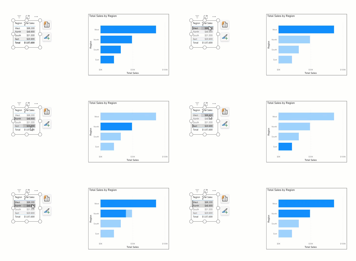
A table visual makes the sorting logic transparent. Users can see that West appears first because it has the highest sales, not because someone manually arranged the list.
For more table layout ideas, see this guide on creating a Power BI table visualization.
Create a Dynamic Region Ranking Measure
The table sort only works well when the measure accurately reflects the ranking you want. In most sales dashboards, Total Sales is enough. But you may need to rank regions by profit, order count, year-over-year growth, or target achievement.
Create a ranking measure with DAX:
Region Rank =
RANKX(
    ALLSELECTED(Region[Region]),
    [Total Sales],
    ,
    DESC,
    DENSE
)
This formula uses the RANKX function to rank each region based on Total Sales.
Here is what each important part does:
- ALLSELECTED(Region[Region]) considers all regions that remain visible after report filters.
- [Total Sales] provides the value Power BI compares.
- DESC assigns rank 1 to the region with the highest sales.
- DENSE ensures ranks stay consecutive when two regions have the same value.
For example, if West and North both rank first, Power BI assigns rank 1 to both and rank 2 to the next region. It does not skip to rank 3.
Add Region Rank to the table visual with Region and Total Sales. Sort by Region Rank in ascending order. This approach makes the ranking easier to validate during testing.
Sales Target Achievement % =
DIVIDE(
    [Total Sales],
    SUM(Sales[Sales Target]),
    0
)
You could then sort the table by Sales Target Achievement % instead of Total Sales. This often gives sales leaders a better view because a smaller region may exceed its target even when it produces less overall revenue.
Use the same logic with other common KPIs:
Total Orders = DISTINCTCOUNT(Sales[Order ID])Sales LY =
CALCULATE(
[Total Sales],
SAMEPERIODLASTYEAR('Sales'[Order Date])
)Sales Growth % =
DIVIDE(
[Total Sales] - [Sales LY],
[Sales LY],
0
)The Sales LY measure calculates total sales for the equivalent period last year. It requires a proper Date table. Create one, relate it to Sales using Order Date, and mark it as a date table in Table tools. Without this foundation, time-intelligence formulas may return incomplete or unexpected results.
If you need to apply responsive filter logic inside measures, this guide on using SELECTEDVALUE in Power BI DAX filters is a useful next step.
Pro Tip: In my experience, ranking by sales alone can hide operational problems. I usually add profit, growth percentage, or target achievement to the selector table before publishing the report. A region with high sales but low profit deserves attention.
Use a Fixed Sort Order Instead
Sometimes you do not need dynamic sorting. For example, a business may always want regions ordered by strategic priority:
- West
- North
- South
- East
Or a product group may need this display order:
- Premium
- Standard
- Clearance
In these cases, use Sort by column instead of trying to sort the slicer by a measure.
Create a separate Region table with a numeric sorting column:
| Region | Region Sort Order |
|---|---|
| West | 1 |
| North | 2 |
| South | 3 |
| East | 4 |
Then follow these steps:
- Select the Region column in Data view or Model view.
- Open Column tools.
- Select Sort by column.
- Choose Region Sort Order.
- Add Region to a standard slicer.

The slicer now follows the numeric order you defined. This option works well for fiscal months, workflow stages, business divisions, and predefined priority lists.
For a full walkthrough of this technique, read how to sort a slicer by another column in Power BI.
Do not use this approach if sales results must determine the order. A calculated sort column refreshes only when the dataset refreshes. It does not react immediately when a user filters the report to a different year, product, or sales channel.
After testing the interactions, publish the report to a workspace in the Power BI Service. A workspace is a shared area where your team stores, manages, and shares reports, semantic models, dashboards, and apps. Test the report in the service because users may experience layouts differently in a browser than in Power BI Desktop.
Things to Keep in Mind
- Native slicer limitation: A standard Power BI slicer cannot dynamically sort its values by a measure. Use a ranked table or matrix when the display order must respond to filters.
- Use a star schema: Keep Region, Product, Customer, and Date in separate dimension tables connected to the Sales fact table. This structure makes DAX measures more reliable and easier to maintain.
- Avoid calculated columns for dynamic ranking: A calculated column evaluates during data refresh, not when users click slicers. Use measures for interactive report calculations.
- Handle blank values early: Empty region or product names appear as blank selections and reduce trust in the report. Clean source data in Power Query or filter blanks from the visual.
- Keep the selector focused: Do not show hundreds of rows in a ranked table selector. Use a Top N filter, product category filter, or search option when the list becomes too long.
- Protect sensitive data: Apply Row-Level Security when different regional managers should only see their own sales data. This rule filters the report based on the signed-in user.
Frequently Asked Questions
Can I sort a Power BI slicer by a DAX measure?
No, the native Slicer visual does not support dynamic sorting by a DAX measure. You can use a table or matrix visual sorted by the measure as a slicer-like selector instead.
Why does my Power BI slicer sort alphabetically?
A slicer usually sorts text fields alphabetically because it displays values from a column. You can change this only by using a related sort column, not a dynamic measure.
How do I rank products by sales in Power BI?
Create a Total Sales measure, then create a RANKX measure that ranks Product by Total Sales. Add Product, Total Sales, and the rank measure to a table, then sort the table by rank.
Can a calculated column sort dynamically in Power BI?
No. A calculated column calculates when the data refreshes, so it does not respond to report filters in real time. Use a measure when the ranking must change with user selections.
Should I use a table or matrix as a dynamic slicer?
Use a table when you need a simple ranked list with one or two supporting measures. Use a matrix when users need hierarchy, such as Region, Country, and Store, in the same selector.
How do I sort month names correctly in a slicer?
Create or use a Month Number column that contains values from 1 to 12. Select the Month Name column, choose Sort by column, and select Month Number.
Sort a standard slicer by a measure is not available natively, but a ranked table selector provides a practical and interactive alternative. Build the ranking with measures, keep the data model clean, and use a fixed Sort by Column setup only when the order should never change. I hope you found this article helpful.
You may also like:
- Create a dropdown slicer in Power BI
- Create a Calendar Table Using DAX
- Use multiple selections in a Power BI slicer
- Create a date slicer in Power BI
- Set up Row-Level Security in Power BI

Hey! I’m Bijay Kumar, founder of SPGuides.com and a Microsoft Business Applications MVP (Power Automate, Power Apps). I launched this site in 2020 because I truly enjoy working with SharePoint, Power Platform, and SharePoint Framework (SPFx), and wanted to share that passion through step-by-step tutorials, guides, and training videos. My mission is to help you learn these technologies so you can utilize SharePoint, enhance productivity, and potentially build business solutions along the way.

